Segmented Control 分段器
使用指南
在 page.json 中引入组件
"usingComponents": {
  "w-segmented-control": "wuss-weapp/w-segmented-control/index",
}
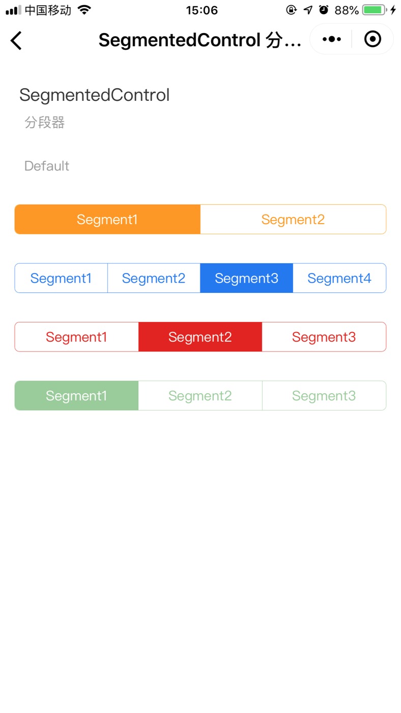
图片演示
代码演示
<view
 style="margin: 30px 0;"
 hover-class="none"
 hover-stop-propagation="false"
>
	<w-segmented-control styles="font-size: 14px;" options="{{ options1 }}" />
</view>

<view
 style="margin: 30px 0;"
 hover-class="none"
 hover-stop-propagation="false"
>
	<w-segmented-control
	 color="#1c75f3"
   defaultIndex="2"
	 styles="font-size: 14px;"
	 options="{{ options2 }}"
	/>
</view>

<view
 style="margin: 30px 0;"
 hover-class="none"
 hover-stop-propagation="false"
>
	<w-segmented-control
   color="#e42112"
   defaultIndex="1"
	 styles="font-size: 14px;"
	 options="{{ options3 }}"
	/>
</view>

<view
 style="margin: 30px 0;"
 hover-class="none"
 hover-stop-propagation="false"
>
	<w-segmented-control
   disabled
   color="green"
	 styles="font-size: 14px;"
	 options="{{ options4 }}"
	/>
</view>
data: {
  options1: ['Segment1','Segment2'],
  options2: ['Segment1','Segment2','Segment3','Segment4'],
  options3: ['Segment1','Segment2','Segment3'],
  options4: ['Segment1','Segment2','Segment3'],
},
API
Attribute 属性
| 属性 | 说明 | 类型 | 默认值 |
|---|---|---|---|
| options | 传入的选项组 ['xxx','xxx','xxx','xxx'] | string | [] |
| color | 组件的主色调 | string | #ff9900 |
| disabled | 禁用 | boolean | - |
| defaultIndex | 初始化默认的索引 | number | 0 |
| styles | 自定义样式 | string | - |
Event 事件
| 事件名 | 说明 | 参数 |
|---|---|---|
| onChange | 值改变时触发 | e.detail.value |
Slot 插槽
| 名称 | 说明 |
|---|---|
| slot | 指定的图片验证码 |
Class 自定义类名
| 类名 | 说明 |
|---|---|
| wuss-class | 根节点样式类 |
| wuss-placeholder-class | 验证码输入框的placeholder样式 |